When everything looks the same, nothing gets done
GanttPRO is a project management platform built around Gantt charts. By 2021 it had grown to 800,000 registered teams — but the product hadn't had a systematic design pass since its original launch. The interface had accumulated years of incremental decisions: task names, subtasks, dates, statuses, and assignees all competed for attention at the same visual weight. Nothing was prioritized. Everything looked equally important, so nothing felt important.
I joined as the sole designer with a mandate to rebuild the visual and interaction foundation of the entire platform — desktop first, then mobile from scratch.
Three compounding failures
Discovery surfaced three distinct problem layers that needed addressing together:
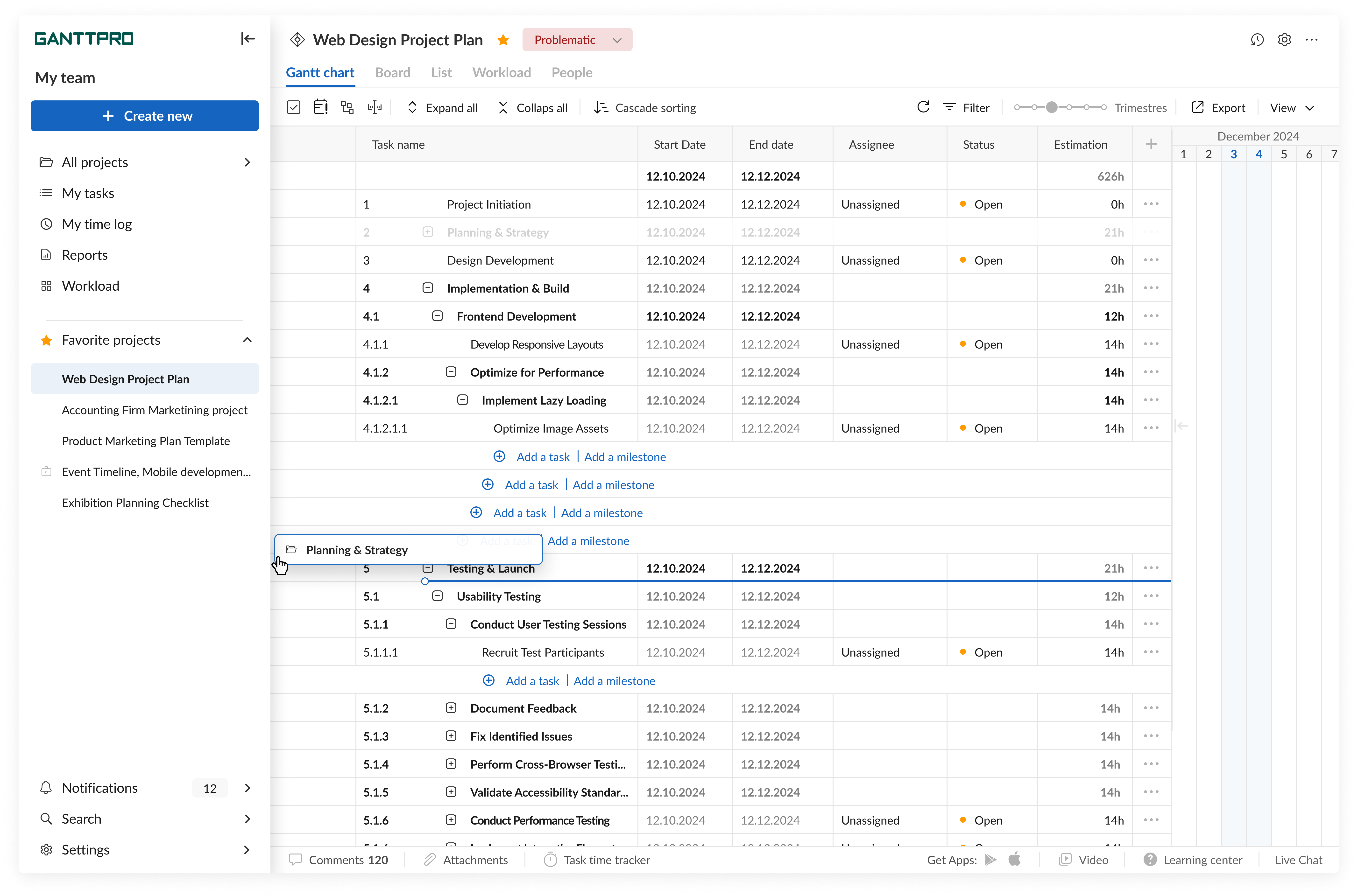
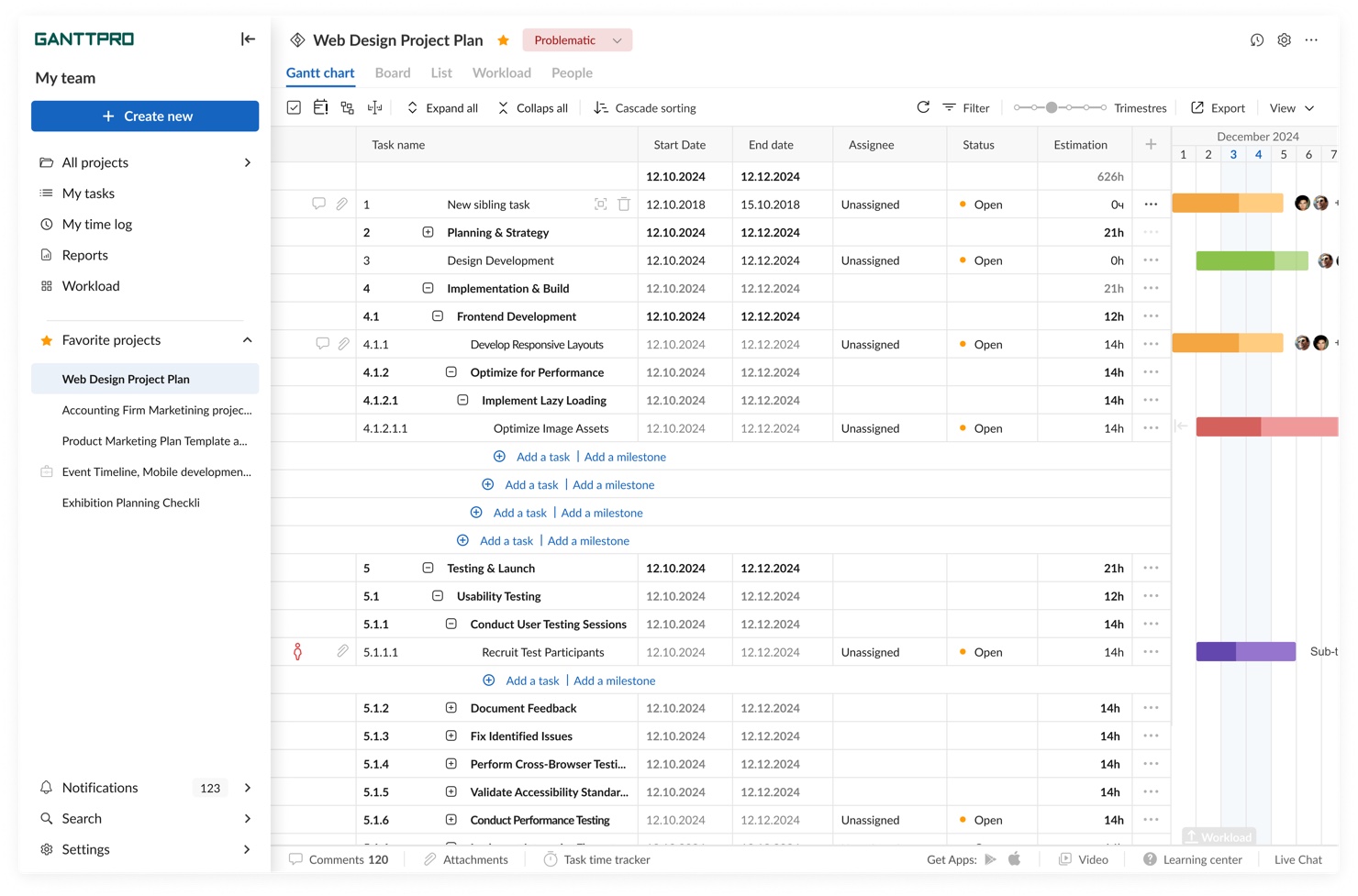
- Visual hierarchy collapse — All UI elements shared the same typographic and color weight. Users couldn't scan a project at a glance; every row demanded the same cognitive effort.
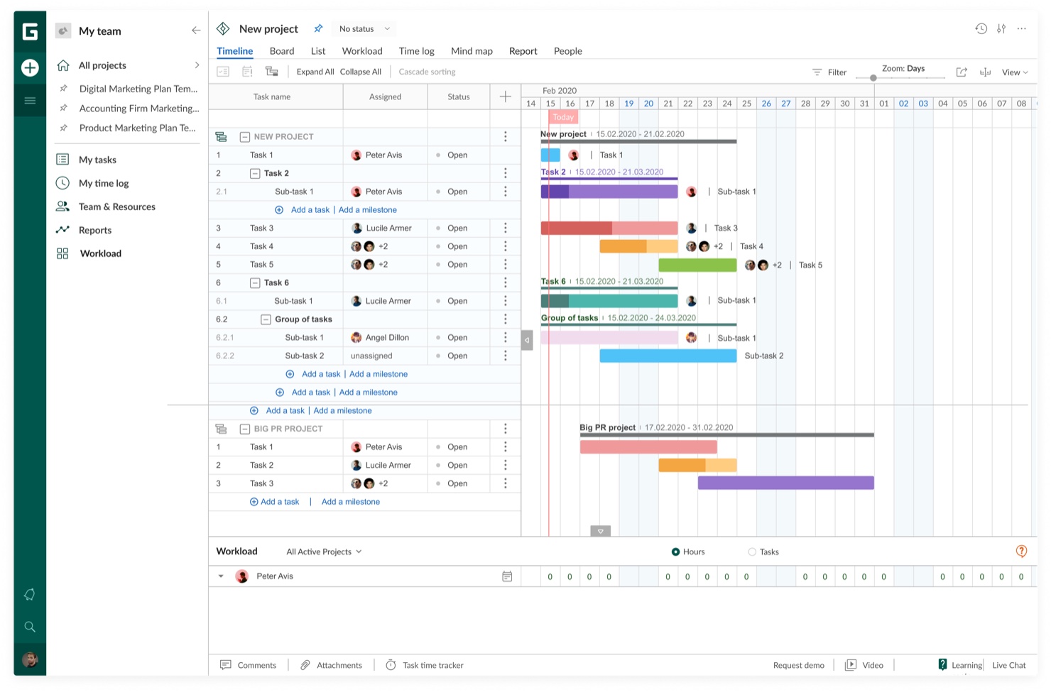
- Missing data views — Power users managing large projects had no way to work in a tabular, data-dense format. The Gantt chart was the only view — appropriate for timelines, but not for bulk editing or reporting.
- Mobile as an afterthought — The mobile app had critical gaps: no deletion confirmations, no download feedback, errors without recovery paths. It was a port, not a product.
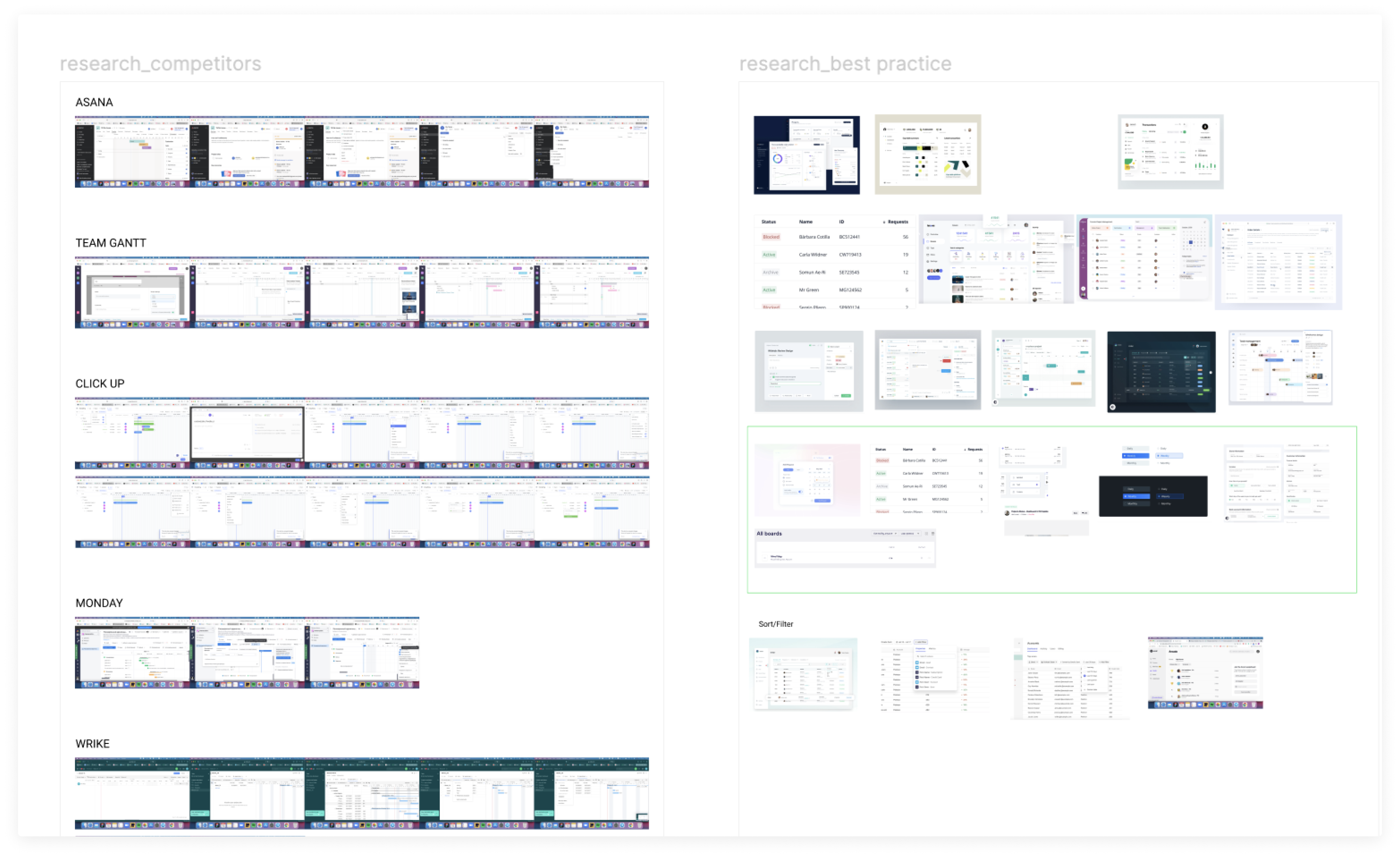
Competitive benchmarking, three concepts, one direction
Benchmarked Asana, ClickUp, Monday, Wrike, and TeamGantt across 14 dimensions: information density, navigation, mobile parity, onboarding, empty states, error handling. Identified where GanttPRO was behind market expectations and where it had latent strengths.
Rather than iterating on the existing interface, I built three fundamentally different visual concepts — varying in density, color usage, and navigation paradigm — and tested them with real users before committing. Direction 2 (structured density with clear hierarchy) won decisively.
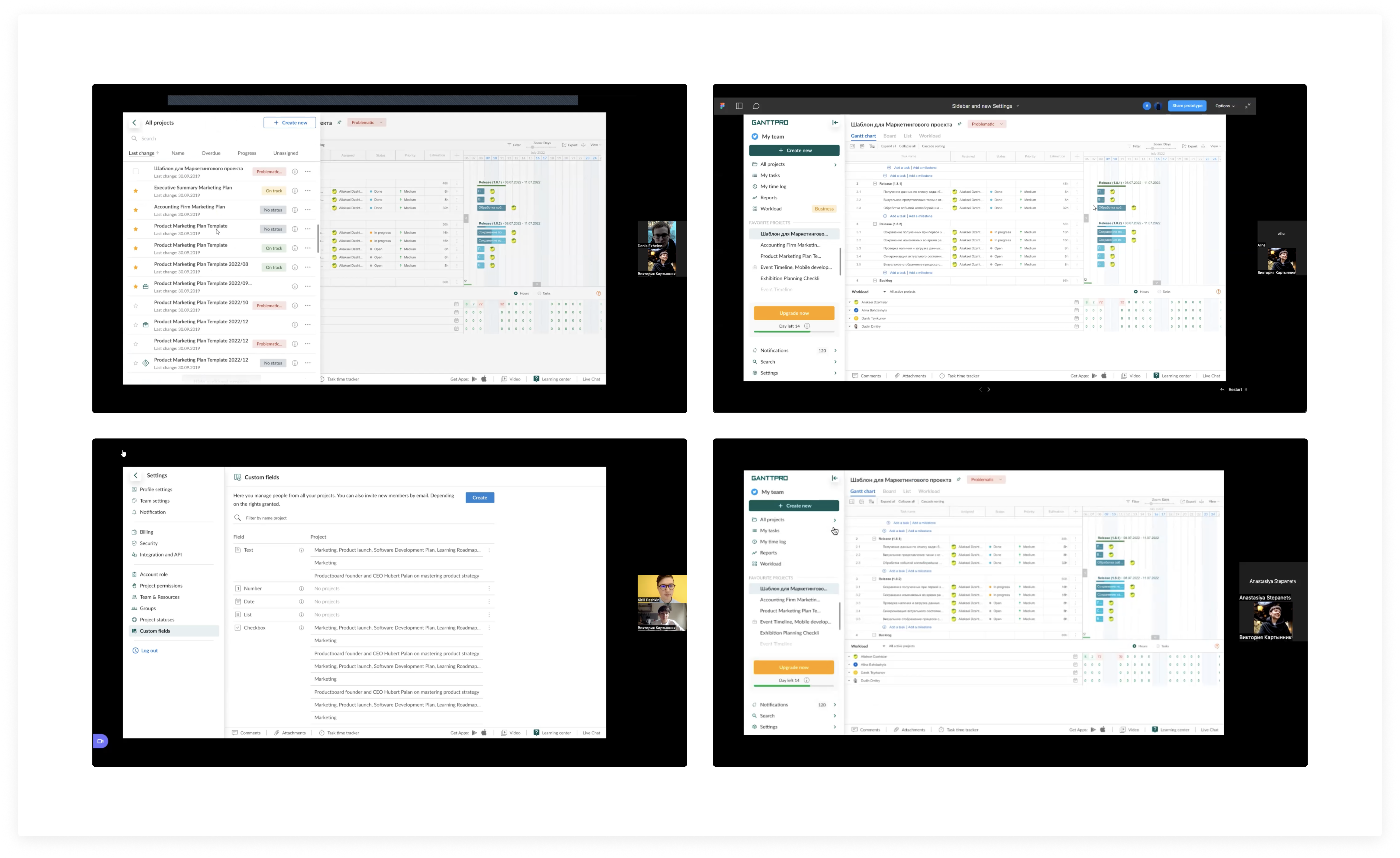
Rebuilt the task row system with a clear typographic hierarchy. Designed a new Grid view for data-intensive workflows — giving power users the spreadsheet-like control they'd been requesting for years.
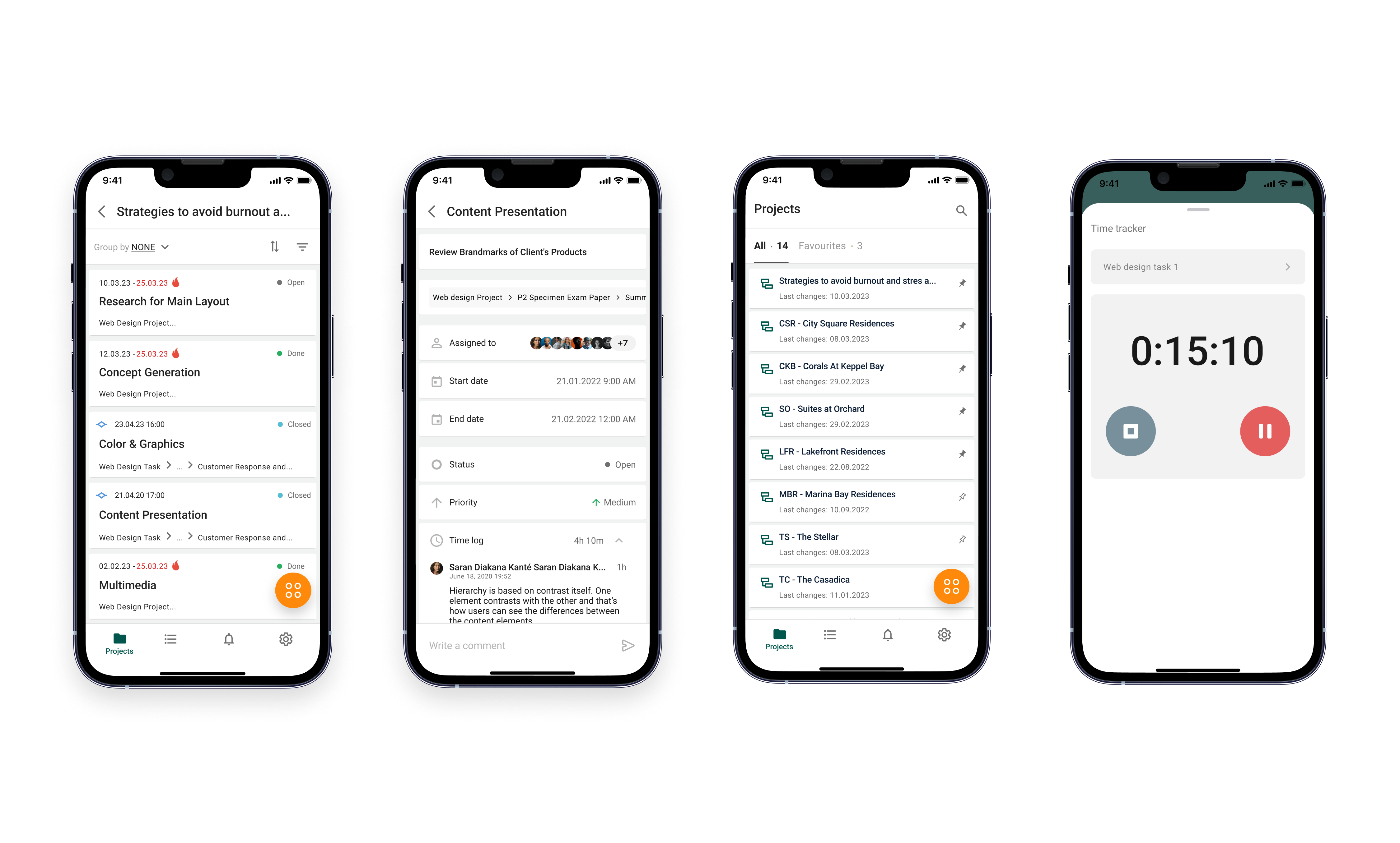
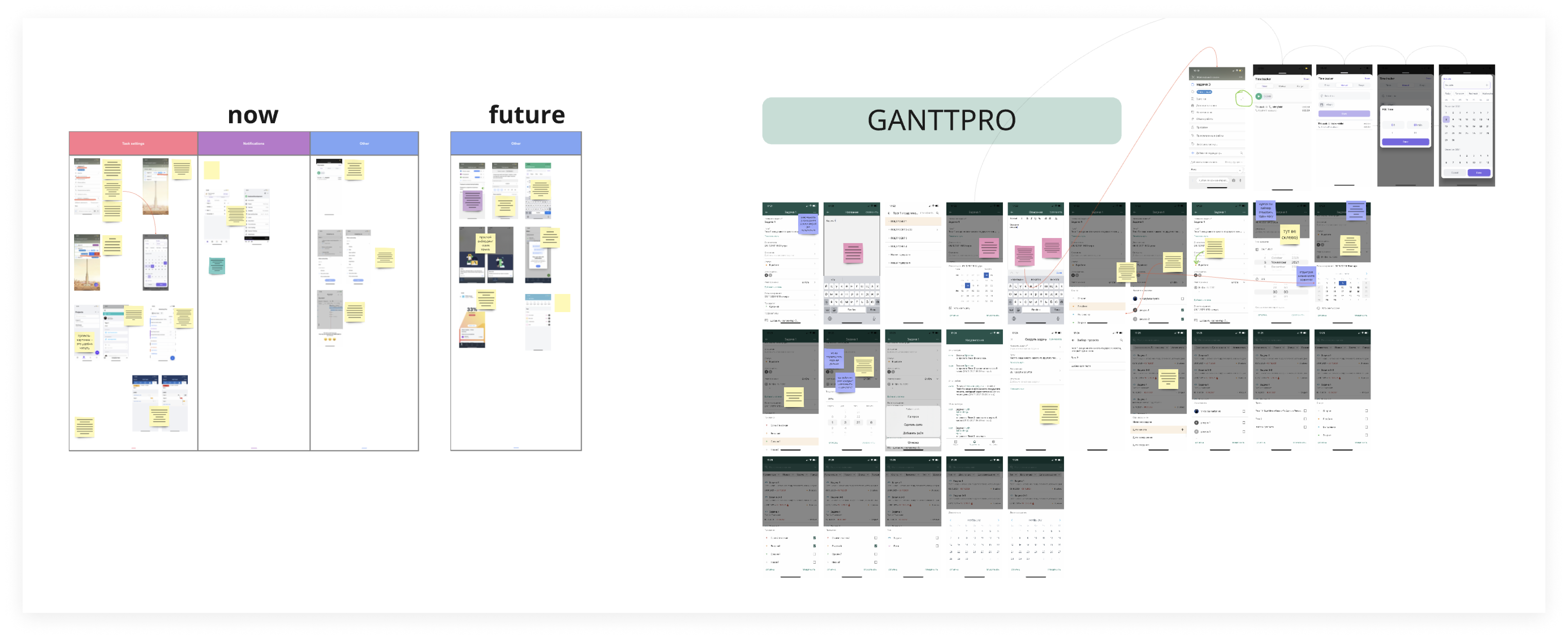
Designed the complete iOS and Android experience from zero — task management, time logging, attachments, notifications. Documented 40+ edge cases before development began to prevent the gaps that had plagued the original app.
Built the first systematic design system for GanttPRO mobile: component library, interaction patterns, spacing tokens, color semantics. Established infrastructure the team continues building on.
The design foundation GanttPRO uses today
The redesign shipped incrementally across 2021–2023 and became the visual and structural foundation of GanttPRO's current product. The mobile app went from a feature-incomplete port to a first-class product. As sole designer, I built infrastructure — components, patterns, documentation — that the team continues to extend today.